Notes, Links, and Photos (8 April 2024)
Consistency and homogeneity are not the same thing #
“Inconsistency is a feature, not a bug – Terence Eden’s Blog”
The thing that makes Google’s later icons extraordinarily incompetent is that the old icons were consistent in terms of style, colours, shading, etc. The new icons are worse because they are less identifiable.
Google and Apple have been driving towards greater uniformity and less variation in their software design languages over the past few years, but their uniformity doesn’t mean they’re genuinely more consistent designs
For example, the older icons tended to have a consistent approach to using metaphor, whereas the newer icons are basically deconstructed abstract shapes that make no sense UNLESS you actually remember the older icons they’re referencing
These are just bad designs. Plain and simple.
Links #
- “Antitrust, Meta, Apple and more | Ian Betteridge”
- “using chatgpt and other ai writing tools makes you unhireable. here’s why | by Doc Burford | Medium”. This too is really good.
- “EU votes to ban riskiest forms of AI and impose restrictions on others | Ars Technica”. ‘The “obligations for high-risk systems” will only take effect after 36 months, the announcement said.’ Mark my words, 36 months from now, tech cos will say that they didn’t get any advance notice about the law taking effect.
- “a lot of people think auteur theory is bad, but the truth is way, way funnier than they realize. like, my guy, it’s legitimately hilarious. enjoy. | by Doc Burford | Medium”. This too was really quite good. A bit on the long side but worthwhile. And not just because I agree 100% with its take on auteur theory.
- ”the biggest threat facing your team, whether you’re a game developer or a tech founder or a CEO, is not what you think | by Doc Burford | Mar, 2024 | Medium”. This essay is well worth your time.
- “Prototypes, production & fidelity layers | Trys Mudford”
- “On disabled and aria-disabled attributes | Kitty Giraudel”
- “Front-end development’s identity crisis - Elly Loel”. “There is no choice anymore, I can’t escape it. React is so pervasive that almost every job is using it. On the rare occasion that they’re not using it, they’re using something like it.”"
- “Understanding Software – Ceejbot’s notes”. “Why? Because communication is, as we nerds like to say, an order N squared problem. Adding the 10th person to a project team adds 9 new lines of communication to worry about to everybody.”
- “The Miseducation of Kara Swisher | Edward Ongweso Jr.”
- “Are large language models on the trajectory of word processing or digital advertising?”
- “NYC AI Chatbot Touted by Adams Tells Businesses to Break the Law | THE CITY — NYC News”. This was entirely predictable. As is the fact that the chatbot is still available giving incorrect advice.
- “Debunking the Myths of Robert Capa on D-Day | PetaPixel”. This is all kinds of interesting.
- “Women’s faces stolen for AI ads selling ED pills and praising Putin - The Washington Post” 😬
- “Fill up those praise folders | everything changes”
- “AI bots hallucinate software packages and devs download them”. As I pointed out recently, the purpose of most software dev (esp. web) is to present the image of an org working with cutting edge tech. Delivering working software or usable business tools is beside the point so this is actually perfect.
- “We’ve been here before: AI promised humanlike machines – in 1958”
- “The Case for Design Engineers, Pt. III - Jim Nielsen’s Blog”. “But the creative process is not an assembly line. Complications and in-process revisions are something to be embraced, not feared, because they are an inherent part of making.”"
- “Adactio: Journal—Who knows?”. This is why just-in-time research is the only way to go. Don’t try to keep up. Instead use that time to research each task as it comes up 🙂
- “We have a content quality problem, not a content quantity problem // Cory Dransfeldt”
- “The Assist @ Things Of Interest”. “AI coding assistance seems like an addition, but it actually removes the human from a part of the process where the human was actually extremely valuable.”"
- “Can Using a Grammar Checker Set Off AI-Detection Software? | EdSurge News”. “AI” checkers don’t work. And grammar checkers don’t work (much of the advice is outright incorrect). Combine the two to make disasters.
- “Thoughts on embedding alternative text metadata into images – Eric Bailey”
- “Doing their hype for them • Buttondown”. ‘The central claim of the tech companies selling LLMs is that any work that people do that results in text artifacts is just “text in-text out” and can therefore be replaced by their synthetic text-extruding machines.’ And all too many people I know buy this line from them.
- “The most beautiful word in the world is ‘No’ — Chocolate and Vodka”. This whole post is very relatable. Esp. the bit about feeling like a financial failure 😅
- “DHS report rips Microsoft for ‘cascade’ of errors in China hack - The Washington Post”. Microsoft has a long, long, long history of being the absolute worst at security and yet it has zero effect on its business because software quality genuinely does not matter one jot
- “Jon Stewart Confirms Apple Wouldn’t Let Him Do Show on AI With FTC Chair”. ‘Tech co doesn’t let contractor talk to FTC’ is always going to be a bad look, no matter the context
- “Substack Is Setting Writers Up For A Twitter-Style Implosion – Home With The Armadillo”
- “How we’re approaching theming with modern CSS - Piccalilli”
- “You Are All On The Hobbyists Maintainers’ Turf Now”. I’ve been saying for a while that commercial software today is fundamentally about extracting value from OSS (I leave out the “F” intentionally). Most code in the software people interact with, even on closed platforms, is open.
- “Don’t modernize your code just for the heck of it | Go Make Things”. This. “Modernising” a code base is quite often a prelude to some of the worst software disasters you’ll ever see. It requires much greater expertise than just writing for a new project
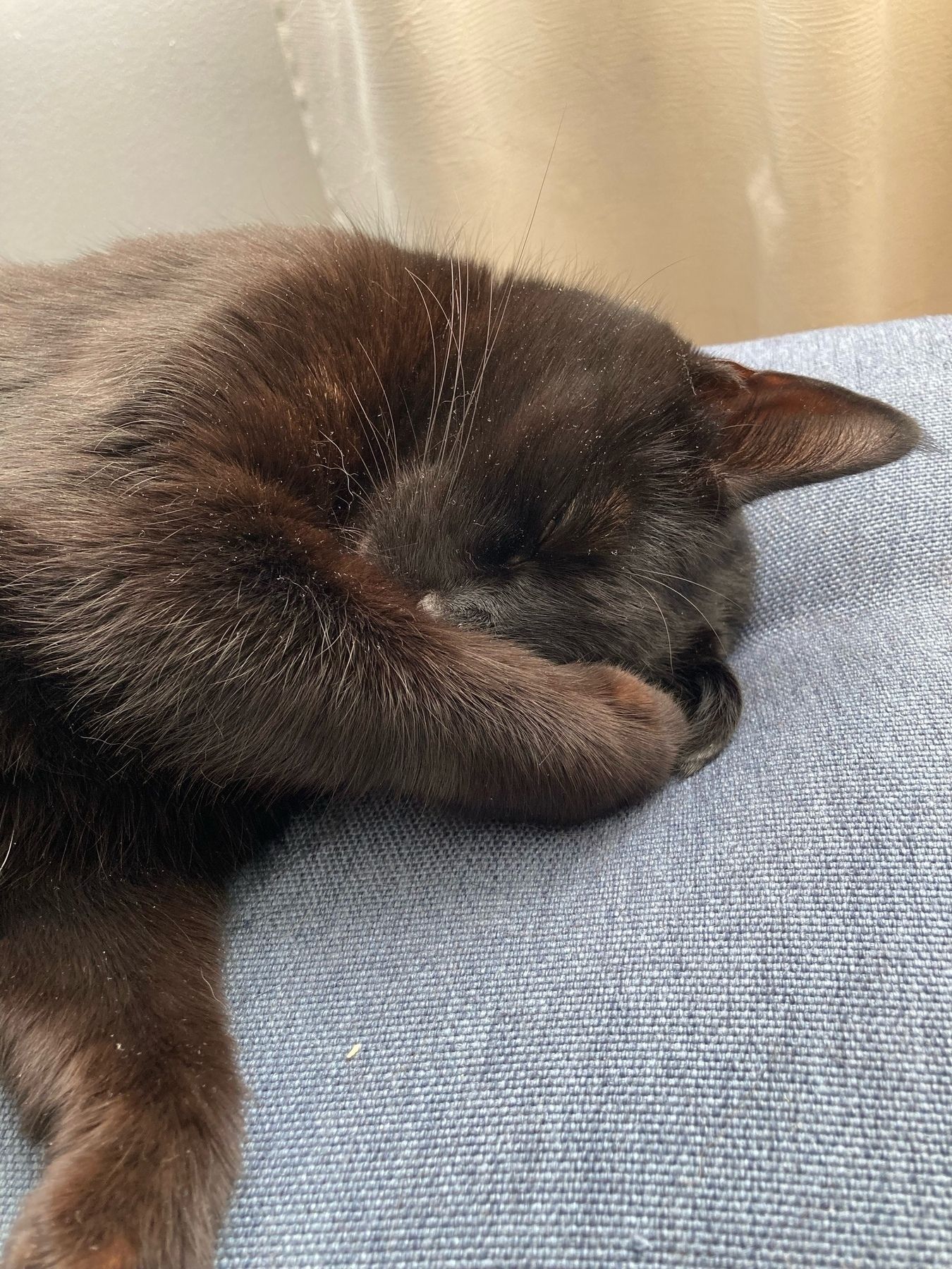
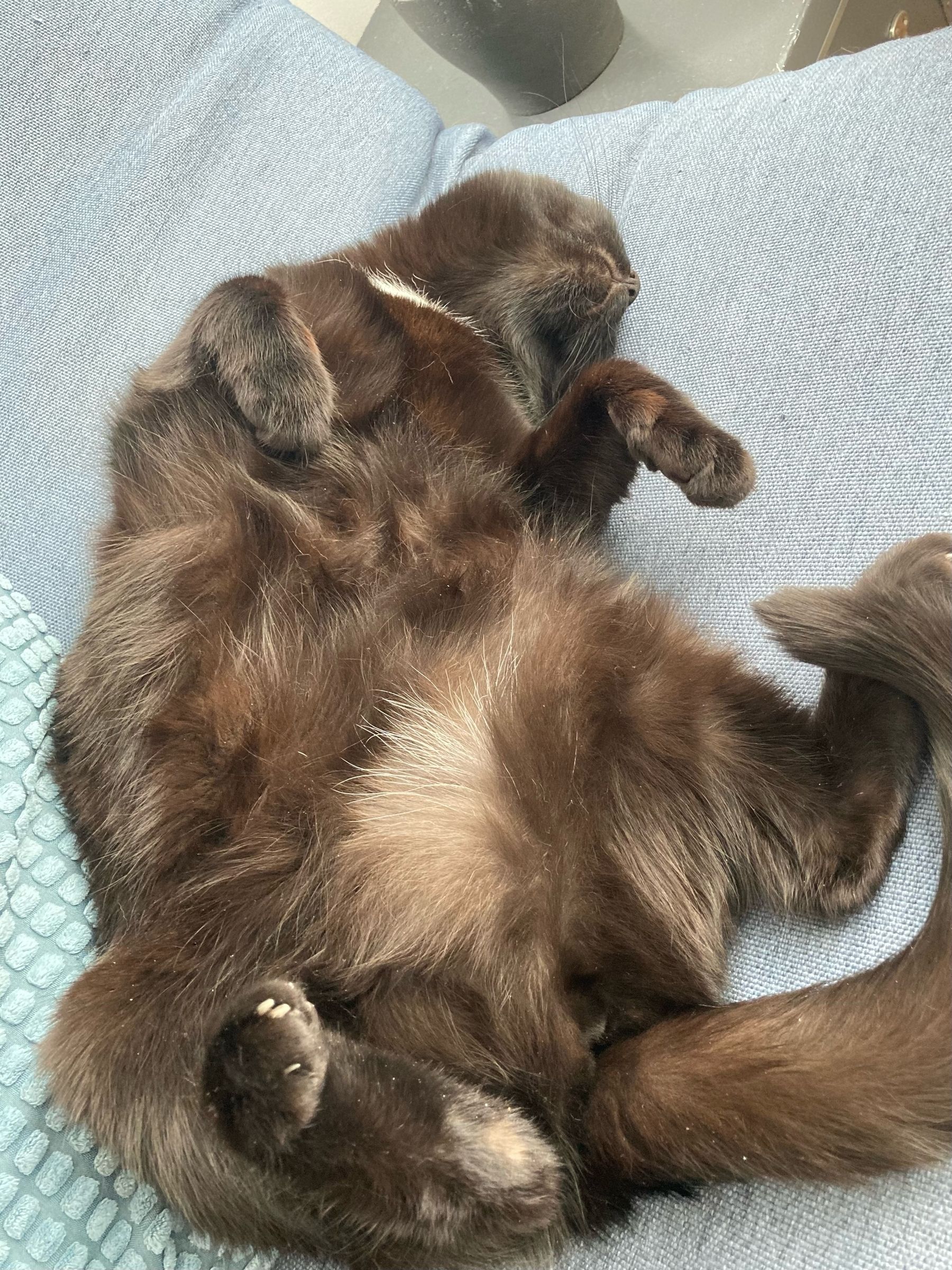
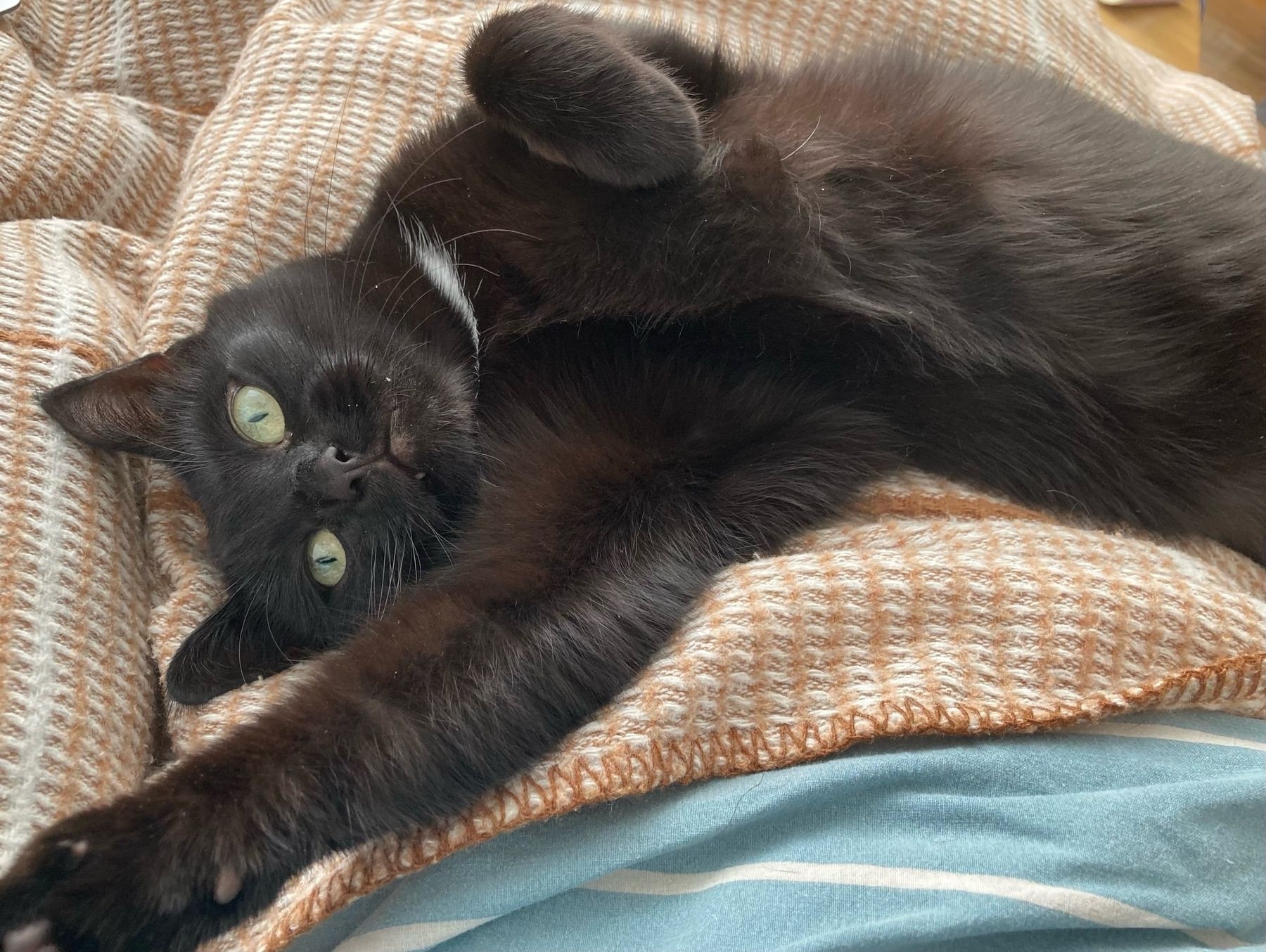
Photos #
My sister just sent me another batch of photos of her cat, Kolka, who is very much enjoying the comfort of indoors
(Kolka spent the first 18 months of her life outdoors in the Icelandic weather and seems to be quite done with outdoors thankyewverymuch, to my sister’s relief.)