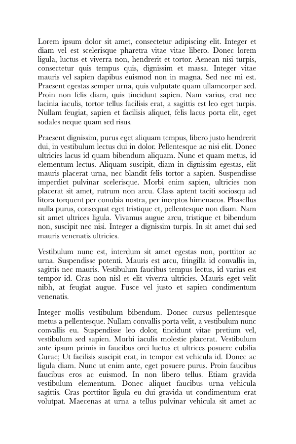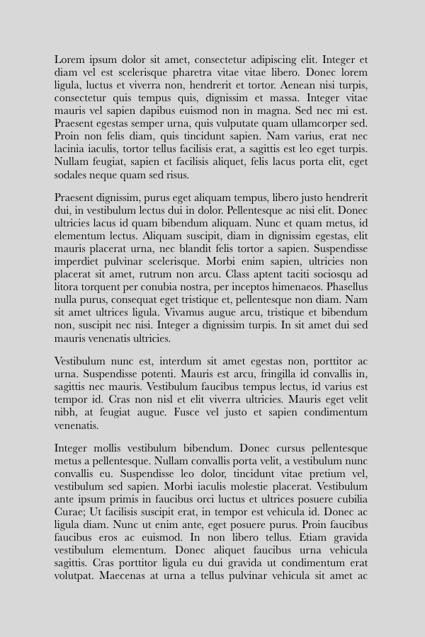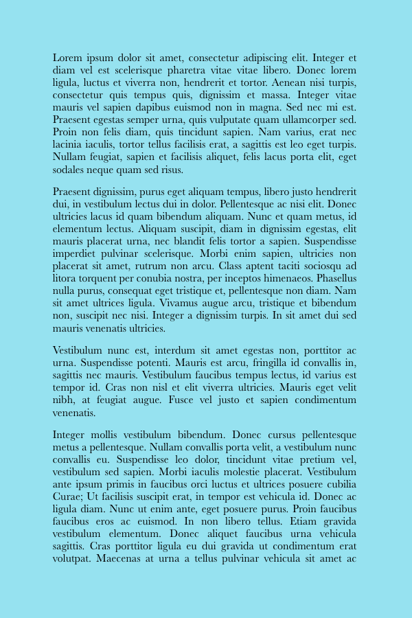
I’ve included a few very simple and silly examples below, just in case I need to justify the need for full bleed backgrounds. Full bleed backgrounds are something that really does have a dramatic effect on the emotions and context of a design.
None of these examples should be problematic to implement in CSS as it is. The question that remains is how it would work in practice with something as non-standard as your average ebook reading system’s paginated view.
First of all, taking away the designer’s ability to override the page’s margin severely limits their ability to apply backgrounds that extend to the page’s borders.
Where the basic page margins originate also dictate where we attach our backgrounds. If the margins are on the HTML element and not the body, then the backgrounds need to go on the HTML element.
There also needs to be some consideration as to how repeating background images are treated on subsequent pages.
Personally, I think a paginated HTML file should be treated as a multicolumn, single-window, area for background purposes.
Also, a very useful addition would be if they added a ‘cover-page’ value to the background-size property. This would, to use the terminology from the spec, scale the image, while preserving its intrinsic aspect ratio (if any), to the smallest size such that both its width and its height can completely cover the current page without flowing into the next page. This would let us easily do full-bleed designs for the openings of chapters in the style of my fourth example.
You could do the fourth example without extending CSS, but the ebook developer would have to create a separate XHTML file for the opening titles of the chapter.


